
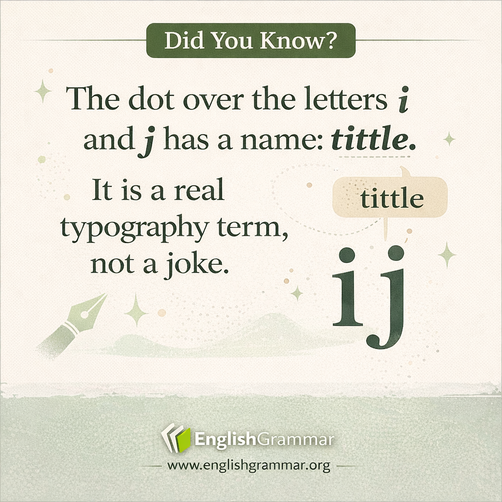
The small dot above the lowercase letters i and j has a proper name: a tittle. In typography and handwriting, it refers to the dot or small mark that completes certain letterforms.
Why does this matter? That dot helps readers recognize the letter quickly. Without it, a lowercase i can look like an l (ell) or just a short stroke, especially in some fonts or fast handwriting.
For example, compare these words:
- fill vs fiil (the second looks confusing because i and l can blur together)
- jail vs iail (the tittle helps signal that the first letter is j, not i)
The term is old, and it comes from a Latin root meaning a small mark or stroke. In modern usage, it often shows up in the phrase to dot the i’s and cross the t’s, which is about paying attention to tiny details.
In short, the tittle is a tiny part of a letter, but it plays a big role in clarity and readability.
